St Baldricks Promotion
Sport Clips partners with the St. Baldrick’s Foundation each year to raise funds for kids with cancer. When designing this project in 2024–2025, I knew I needed to create something eye-catching, playful, and childlike, while also clearly informing people and encouraging them to donate. These campaign materials were sent out to Sport Clips stores nationwide, ensuring a consistent and impactful message across the country. Overall, the final design is both thoughtful and well-executed, adding strong visual support to the campaign's mission.
Infographic and Sticky Notes
While customers are encouraged to donate to the organization, I felt it was important to design an infographic that clearly explained what they were donating to and why their support matters. When creating the infographic, I focused on guiding the viewer’s eye and using visuals that could tell a story on their own. To make the experience more interactive, customers who chose to donate during checkout were invited to take a sticky note and place it near the poster displayed in the store’s lobby, creating a growing, visual show of community support.


Mirror Clings
Each mirror cling was placed at the cutting station mirrors throughout the store, featuring the story of a child with cancer. My goal with this design was to incorporate the tile motif while highlighting each child’s photo in a unique shape that stood out among the surrounding squares. This approach aimed to not only catch attention but also create an emotional connection, encouraging customers to donate during checkout.


Table Tent
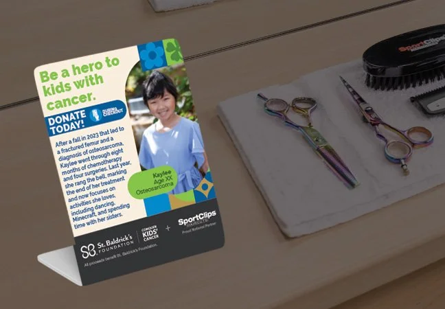
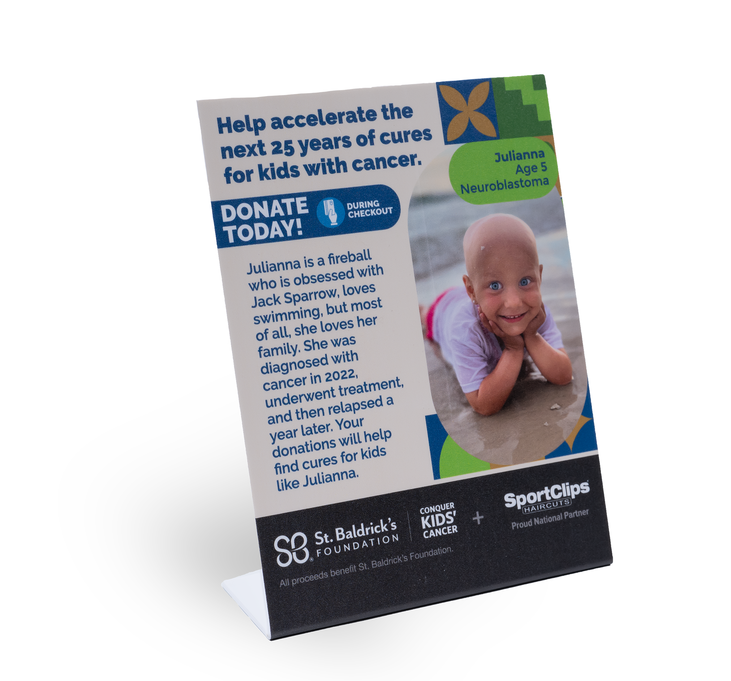
Table tents were placed throughout the store, at cutting stations and the front desk, to highlight another child’s story and encourage donations. Each design continued the visual storytelling of the campaign, using bright colors, engaging shapes, and heartfelt imagery to connect with customers and inspire them to support the cause.


Floor Decal
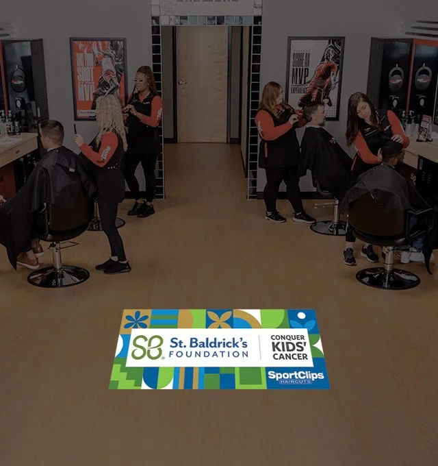
The floor decal was a large vinyl installation placed in the center of the cutting floor. While not heavy on information, it served as a bold visual element that brought significant attention to the organization. I’m proud of how the design turned out; the tile layout perfectly framed the St. Baldrick’s logo, and the playful die-cut edges added a unique touch that helped the piece stand out and draw customers’ eyes.


